A customer lands on your website ready to book a service, buy a product, or contact your team. If they cannot read the text, navigate the menu with a keyboard, understand a form error, or complete checkout, that opportunity can disappear fast. This website accessibility compliance guide helps small business owners make practical improvements that serve more people while reducing avoidable compliance risk.
Accessibility is not a one-time design feature or a checkbox added after launch. It is an ongoing part of how you plan pages, publish content, update themes, and choose website tools. The good news is that many of the highest-value improvements are straightforward once you know what to review.
What Website Accessibility Compliance Means
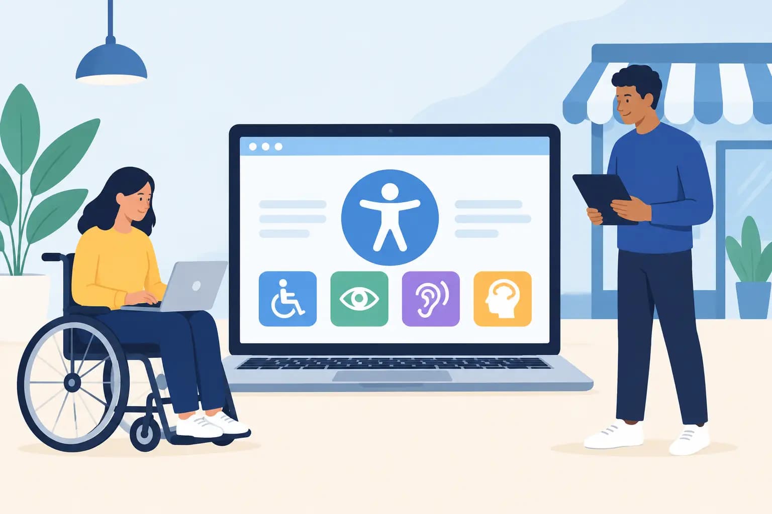
Website accessibility means designing and maintaining a site so people with disabilities can use it. This includes visitors who are blind or have low vision, are deaf or hard of hearing, have limited mobility, experience cognitive differences, or use assistive technology such as screen readers, keyboard navigation, magnification tools, or voice controls.
In the United States, the Americans with Disabilities Act, commonly called the ADA, is central to many website accessibility discussions. Court decisions and enforcement activity have made accessibility a serious consideration for businesses that serve the public online. Requirements can vary by business type, location, and circumstances, so legal questions should be reviewed with qualified counsel.
For day-to-day website work, the Web Content Accessibility Guidelines, or WCAG, provide the most useful technical framework. WCAG is organized around four principles: content should be perceivable, operable, understandable, and compatible with assistive technologies. Many organizations use WCAG 2.1 Level AA as a practical target, while WCAG 2.2 adds newer success criteria that are worth considering for current projects.
Compliance is not just about avoiding complaints. An accessible site usually has clearer content, better forms, simpler navigation, and fewer barriers for every visitor. That can support customer trust, lead generation, and online sales.
Website Accessibility Compliance Guide: Start With the Customer Journey
Do not begin by trying to inspect every line of code. Start where your visitors take action. A local service business may prioritize its contact form, scheduling page, service pages, and phone links. An online store should focus on category navigation, product pages, cart functions, and checkout. A nonprofit may need to review donation forms, event registrations, and downloadable resources.
Walk through these key tasks as if you were a first-time customer. Can you find what you need? Can you complete the task without a mouse? Does the page clearly explain what happens after submitting a form or placing an order? This approach keeps accessibility work tied to real business results rather than isolated technical fixes.
Make navigation work with a keyboard
Many people cannot use a mouse consistently. A visitor should be able to use the Tab, Shift + Tab, Enter, and arrow keys to move through navigation menus, buttons, forms, pop-ups, and checkout steps.
Open your site and press Tab repeatedly. You should always see a clear focus indicator showing where you are on the page. The focus order should follow a logical path, and there should be no place where the keyboard gets trapped. A visible “Skip to content” link near the top of a page can save keyboard users from tabbing through the same navigation on every visit.
Custom sliders, pop-ups, menus, and page builder widgets deserve extra attention. They may look polished but still create obstacles if they were not built with keyboard behavior in mind. If a visual effect blocks access to essential content, choose usability over decoration.
Use clear text, headings, and contrast
Headings do more than make a page look organized. Screen reader users often move through a page by heading, so heading levels should describe the structure of the content. Use one clear main heading, then organize sections with logical subheadings. Avoid selecting a heading style only because you like its size.
Text also needs enough contrast against its background. Light gray text on white may match a modern brand style, but it can be difficult to read for many visitors. Contrast problems are especially common in promotional banners, buttons, text over images, and footer links.
Plain language helps as well. Explain services, pricing, next steps, and policies directly. A short, descriptive button such as “View hosting plans” gives more context than a generic “Click here,” especially when someone is listening to the page through a screen reader.
Add meaningful alternatives for images and media
Every informative image should have alternative text that communicates its purpose. If a photo supports a service page, describe the relevant information, not every visual detail. For example, an image of a technician installing network equipment may need alt text only if it adds meaning to the page. A purely decorative background flourish generally should not be announced at all.
Do not use alt text as another place to repeat keywords. Useful descriptions are concise and specific. Product images, charts, location maps, and graphics with text often need more careful treatment because they can contain information that is otherwise unavailable to a nonvisual visitor.
Videos should include accurate captions. If a video communicates visual information that is not explained aloud, consider a transcript or audio description. For businesses using promotional videos, tutorials, or recorded webinars, this can also help visitors who prefer to scan the information before watching.
Build forms that explain errors clearly
Forms are one of the most common accessibility trouble spots and one of the most costly places to lose a lead. Each field needs a visible label. Placeholder text inside a field is not a reliable replacement because it often disappears once a visitor starts typing.
Required fields should be identified in more than color alone. When there is an error, the message should explain what happened and how to fix it. “Enter a valid email address” is far more useful than a red outline with no explanation. If your form includes a time limit, CAPTCHA, or multi-step workflow, test it carefully. These elements can create barriers even when the rest of the page performs well.
A Practical Accessibility Review Process
Automated scanners are useful for finding common issues such as missing image descriptions, empty links, weak contrast, and heading problems. They are not a complete answer. An automated tool may report that an image has alt text without telling you whether the description is helpful, or it may miss a keyboard issue entirely.
Use a layered review process:
- Scan key pages to identify common technical errors.
- Test navigation, forms, menus, and pop-ups using only a keyboard.
- Review pages on a phone at different text sizes and zoom levels.
- Check new content for headings, image alternatives, captions, and clear link text.
- Ask a qualified accessibility specialist to assess higher-risk or more complex websites.
For a small business site, start with the pages that receive the most traffic or generate the most revenue. Fix repeated template issues first. Correcting an inaccessible navigation menu, button style, or form field can improve dozens of pages at once.
Keep a simple record of what you reviewed, what you changed, and what remains scheduled for improvement. This is useful for managing vendors, maintaining consistency, and showing that accessibility is being treated as an active responsibility rather than ignored.
Hosting, Themes, and Plugins Can Affect Accessibility
Your hosting plan does not automatically make a website accessible, but reliable hosting supports the work. A stable environment, current software, regular backups, and a safe staging area make it easier to test updates before they affect customers. For WordPress users, a staging environment is especially helpful when updating a theme, page builder, or plugin that controls key site functions.
Choose themes and plugins carefully. A low-cost tool can create long-term problems if its buttons, forms, menus, or pop-ups do not work with keyboards and screen readers. Before adding a feature, test the demo where possible and ask whether the developer documents accessibility support. Fewer well-supported tools are often easier to manage than a website packed with overlapping plugins.
GiddyHost customers can also treat routine website maintenance as part of accessibility care: keep WordPress, themes, and plugins updated; test changes before publishing; and maintain backups in case an update creates an unexpected issue.
Make Accessibility Part of Every Update
The biggest mistake is treating accessibility as a cleanup project that ends when the initial fixes are complete. New product photos, blog posts, staff pages, PDFs, landing pages, and third-party integrations can introduce fresh barriers.
Give everyone who edits the website a short publishing standard. Use real headings, write descriptive links, add purposeful alt text, caption new videos, and test forms before promotion. If your team works with a designer, developer, or marketing contractor, include accessibility expectations in the project brief from the start.
A more accessible website is simply a better front door for your business. When customers can find information, understand their options, and complete the next step without unnecessary friction, your website becomes more useful to more people – which is exactly what it was built to do.